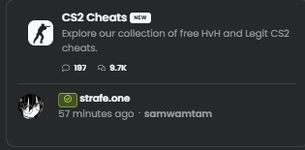
hackvshack.net has been put through a revamp, yet I have heard diffrent opinions about them. Some say its vibecoded, some prefer the old one, and some doesn't have a opinion. I'm here to express myselves about the new ui:
- I believe the UI is too compact, has too much elements and you can get lost easily if you don't know what your doing.
- The UI is not centered, at all. For example: CS2 Cheats has a bit wider gap, it would be better for the ui to be more comfortable or more dynamic
- Since the UI was revamped, I believe that the Icon's and the "prefixes" [Other, Request, Safe, Unknown, etc.] should be revamped too with new colors.
- The website feels a little bland because we do not have customization. We could have so much options to for example the site to be pastel pink for example if someone likes it that way.
- DMA Cheats forum is dead and no one posts anything, except one forum of: "Curious about what obscure game has DMA Cheats". I believe we should remove it.
- The UI is the same, but the design is changed. Practically, nothing changed except UI Rounding at the corners. Its good, but its still too compact.
- The Buttons aren't centered like in the "Post thread" button.
- The staff prefixes that are posted on each forum that tells you if its safe or not, should be revamped. Its the same and its bland.
Summary? Not good, not great. Its in between.
I believe thats enough for now, and thats all I saw and noticed during my search. I know my opinion doesn't really matter to the rest of the users, but to @Plisskien is really important.
User feedback is important.
If you have any other opinions, you can post it here or post feedback about the new UI so we can help Plisskien fix and make other users happy.
- I believe the UI is too compact, has too much elements and you can get lost easily if you don't know what your doing.
- The UI is not centered, at all. For example: CS2 Cheats has a bit wider gap, it would be better for the ui to be more comfortable or more dynamic
- Since the UI was revamped, I believe that the Icon's and the "prefixes" [Other, Request, Safe, Unknown, etc.] should be revamped too with new colors.
- The website feels a little bland because we do not have customization. We could have so much options to for example the site to be pastel pink for example if someone likes it that way.
- DMA Cheats forum is dead and no one posts anything, except one forum of: "Curious about what obscure game has DMA Cheats". I believe we should remove it.
- The UI is the same, but the design is changed. Practically, nothing changed except UI Rounding at the corners. Its good, but its still too compact.
- The Buttons aren't centered like in the "Post thread" button.
- The staff prefixes that are posted on each forum that tells you if its safe or not, should be revamped. Its the same and its bland.
Summary? Not good, not great. Its in between.
I believe thats enough for now, and thats all I saw and noticed during my search. I know my opinion doesn't really matter to the rest of the users, but to @Plisskien is really important.
User feedback is important.
If you have any other opinions, you can post it here or post feedback about the new UI so we can help Plisskien fix and make other users happy.