Welcome to hackvshack.net Forum!
Download Free HvH CS2/CS:GO Cheats, CFG, LUA/JS Scripts, and More!
Register

News SigGen.top - Official Thread

Plisskien

Administrator
User ID:
1
Messages:
2,395
Reactions:
4,652
Badges:
28
REP:
−2/65+
Level:
740
Having a cool signature is a great thing, which is why I (Claude Code) vibe-coded this web application. This thread is meant to collect feedback and user experiences. I’d love to hear what people have to say about it, as I want it to be as useful as possible. To achieve that, I need feedback and information on what should be changed, included, or removed, etc...

E.g. this is what I was able to make! (YES!!, you can generate animated signatures)
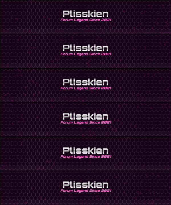
siggen-anim-1773866474184.gif
Or this (even more sexy imo)
siggen-anim-1773880949835.gif
Or this
siggen-anim-1773923749684.gif
Or this
siggen-anim-1774175444474.gif

Link:

ALSO, if you have any cool looking signature, don't forget to share config below (YES! you can generate configs)
My configs are below!
 

Password for .zip file is hvh.net

Last edited:
Having a cool signature is a great thing, which is why I (Claude Code) vibe-coded this web application. This thread is meant to collect feedback and user experiences. I’d love to hear what people have to say about it, as I want it to be as useful as possible. To achieve that, I need feedback and information on what should be changed, included, or removed, etc...

E.g. this is what I was able to make! (YES!!, you can generate animated signatures)
siggen-anim-1773866474184.gif
Or this (even more sexy imo)
siggen-anim-1773880949835.gif
Link:

ALSO, if you have any cool looking signature, don't forget to share config below (YES! you can generate configs)
My config is below!
gui very bloated
 
Can you elaborate, and also provide example?
visually you really need to bump up the contrast and size of your typography. those tiny gray-blue labels against the dark background are tough to read. making the text a bit larger and using a brighter off-white would instantly make the whole interface look cleaner and save people from squinting.also the layout also just needs more room to breathe.the sliders and dropdowns are crammed tightly together ... you could fix this by adding some empty space between the rows will make it look far less intimidating and prevent misclicks.
 
  • Like
Reactions: Plisskien
visually you really need to bump up the contrast and size of your typography. those tiny gray-blue labels against the dark background are tough to read. making the text a bit larger and using a brighter off-white would instantly make the whole interface look cleaner and save people from squinting.also the layout also just needs more room to breathe.the sliders and dropdowns are crammed tightly together ... you could fix this by adding some empty space between the rows will make it look far less intimidating and prevent misclicks.
ty, I'll take it into account
 

Who has read this thread (Total: 1) in last 1 hours View details


